
RadioGroup
import { RadioGroup } from "std-widgets.slint";export component Example inherits Window { width: 200px; height: 150px; RadioGroup { title: "Target Platform"; model: [ { text: "Desktop" }, { text: "Mobile" }, { text: "Embedded" }, ]; current-index: 0; }}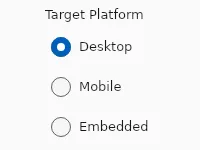
A group of radio buttons where the user can select exactly one option.
Properties
Section titled “Properties”current-index
Section titled “current-index” int (in-out) default: 0
The index of the selected entry in model.
RadioGroup { model: [ { text: "Desktop" }, { text: "Mobile" }, ]; current-index: 1;}current-value
Section titled “current-value” string (in-out) default: ""
The text of the currently selected entry.
enabled
Section titled “enabled” bool default: true
When false, the entire group and all its radio buttons cannot be interacted with.
has-focus
Section titled “has-focus” bool (out) default: false
Set to true when any radio button inside the group has keyboard focus.
struct RadioEntry default: []
The list of options to display. Each entry has text and an optional disabled flag.
RadioGroup { model: [ { text: "Desktop" }, { text: "Mobile", disabled: true }, ];}RadioEntry
Represents one option in a RadioGroup.
text(string): Label shown next to the radio button.disabled(bool): Whentrue, this option is visible but not selectable.
string default: ""
An optional label rendered above the group. When empty, no title is shown.
orientation
Section titled “orientation” enum Orientation default: vertical
Use Orientation.vertical (default) to stack options, or Orientation.horizontal for a single row.
Orientation
Represents the orientation of an element or widget such as the Slider.
horizontal: Element is oriented horizontally.vertical: Element is oriented vertically.
Callbacks
Section titled “Callbacks”selected(string)
Section titled “selected(string)”Invoked when the user selects a different option. The argument is the text of the newly selected entry.
RadioGroup { model: [ { text: "Desktop" }, { text: "Mobile" }, ]; selected(value) => { debug("Selected: ", value); }}© 2026 SixtyFPS GmbH